
The Art of Album Covers: Iconic Designs and the Stories Behind Them

A vinyl record gives music a visible, tangible presence. Before the needle reaches the groove, its sleeve offers a first impression: a face, a landscape, a block of color, or a visual puzzle that sets expectations for what follows.
That relationship between image and sound is a large part of the art of album covers. For collectors, the sleeve can carry creative choices, historical context, and the marks of a record’s life. Looking closely reveals how design helps an album become more than a collection of tracks.
Why Album Covers Matter to Vinyl Collectors
Album covers matter to vinyl collectors because they give a record a visual identity and make listening a physical experience. The sleeve connects an album’s sound to its era, artists, and ideas before the music begins.
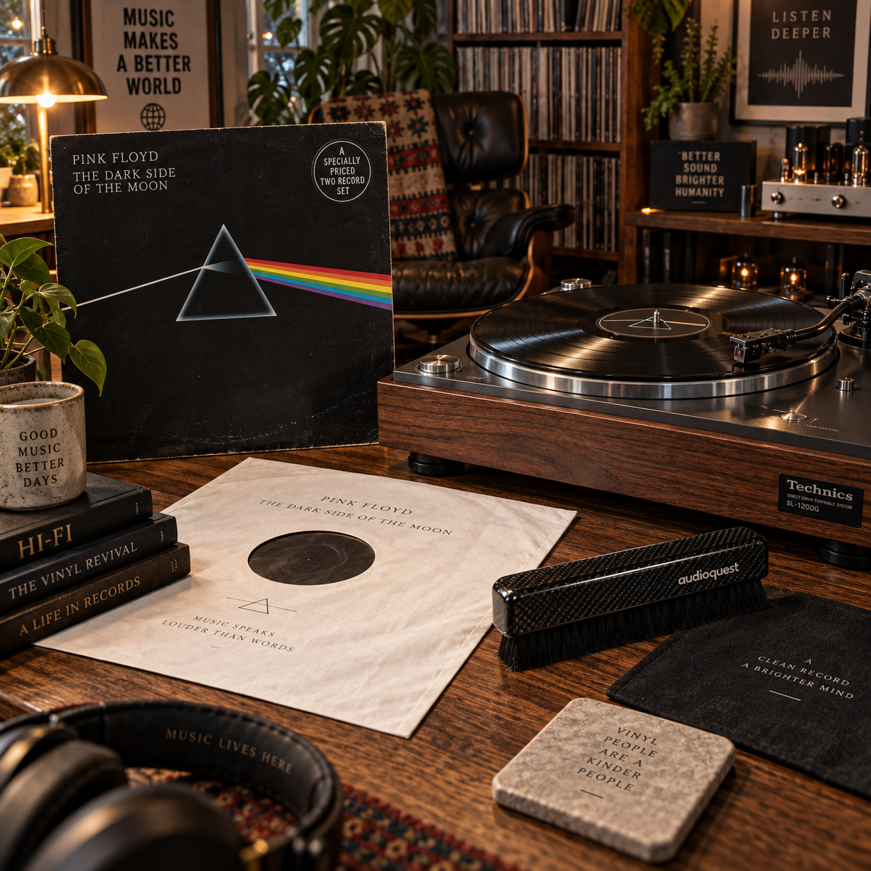
A strong cover can become inseparable from an album’s identity. Think of the stark banana on the cover of The Velvet Underground & Nico, or the prism and spectrum on Pink Floyd’s The Dark Side of the Moon. Each image is simple enough to recognize at a glance, yet specific enough to evoke a particular musical world.
For record collectors, the object itself adds another layer. A sleeve may show how the album was originally presented, while its typography, paper, printing, and layout offer clues about its release. An original pressing can be appealing for its place in a record’s history, though identifying one usually requires checking the label, runout markings, and catalog details, not judging the cover alone.
Album art also invites repeated attention. A small detail that went unnoticed on a streaming thumbnail may become obvious when the jacket is in your hands. The image is part of the encounter, not merely packaging.
How Music Becomes Visual
Album art translates music into images through graphic design, photography, illustration, and collaboration between musicians and visual artists. The result may echo a record’s mood, suggest a story, or deliberately leave its meaning open.
Graphic design organizes type, color, shape, and space. A restrained layout can feel intimate or formal; crowded lettering and clashing colors may suggest energy or unease. These choices shape how the title and artist name meet the image, and how easily the cover is recognized from across a room.
Photography can document a person or place, but it can also create a carefully staged world. Illustration offers a different kind of freedom: artists can invent characters, distort reality, or build a symbolic landscape. Neither approach has a fixed meaning. A photograph may be more mysterious than a drawing, and an illustration can reflect a specific time and place.
The process often involves artist and designer collaboration. Musicians, photographers, art directors, illustrators, and record-label staff may all shape the final sleeve. Their goals can differ: a band might want an image that captures its sound, while a designer may favor a concept that works visually at a glance. The most memorable solutions usually make those aims reinforce each other.
Iconic Designs and the Stories They Tell
Iconic album covers use visual choices that stay recognizable while opening a door to the music’s context. Their stories may be documented, debated, or partly unknown, so it helps to distinguish confirmed background from interpretation.
The Beatles’ Sgt. Pepper’s Lonely Hearts Club Band turns a band portrait into a dense collage of historical and cultural figures. Its crowded composition rewards close inspection, while the theatrical uniforms support the album’s imagined band identity. The cover feels like a scene with its own cast rather than a standard group photograph.
For Abbey Road, photographer Iain Macmillan captured the Beatles crossing a London street. The uncluttered photograph became an instantly recognizable image, and its ordinary setting is part of its force. Viewers have attached many interpretations to the details, but not every popular theory is established fact.
Pink Floyd’s The Dark Side of the Moon, designed by Hipgnosis with George Hardie, reduces a complex musical work to a prism dispersing light into a rainbow. The image is clean and memorable, yet it also suits an album concerned with perception and human experience. The cover’s clarity has helped it endure across generations of listeners.
Other designs make their impact through material or restraint. The original cover of The Beatles’ Yesterday and Today became controversial, while Andy Warhol’s banana for The Velvet Underground & Nico connected pop art with the band’s underground sound. These examples show that a cover’s story may include its production and reception, not only the image’s apparent symbolism.

The Sleeve as Part of the Listening Experience
A vinyl sleeve shapes listening by giving artwork space, sequence, and texture that small digital images cannot reproduce. Gatefold sleeves, printed inner bags, and inserts can make the act of playing a record feel like moving through a visual companion to the music.
A gatefold opens like a book, creating room for panoramic photography, credits, lyrics, or an extended illustration. The extra space can deepen the album’s visual storytelling, though a gatefold is not automatically more meaningful than a single sleeve. What matters is how the format serves the artwork and the record’s presentation.
Printed details reward a slower look. Track listings, production credits, portraits, lyrics, and small design elements can connect the people who made the music to the object in your hands. Even the choice of paper or printing can affect the impression: glossy stock may intensify color, while a matte surface can feel quieter and more tactile.
Vinyl’s large format has a practical limit: sleeves take up space, and older jackets can be fragile. Handling them carefully preserves the artwork and the record. Support the jacket when removing the disc, and avoid placing a sleeve in direct sunlight, where colors may fade.
What Collectors Look for in Album Art
Collectors assess album art by looking at condition, completeness, and edition details, while keeping artistic appreciation separate from market value. A beautiful design can be meaningful at any price, and a rare edition is not necessarily the version with the most appealing presentation.
Start with the jacket’s condition. Check for seam splits, ring wear, creases, writing, water damage, and fading. Then inspect whether the copy includes its original inner sleeve, lyric sheet, poster, or other inserts. These details matter because a complete copy preserves more of the release’s original presentation.
Next, identify the edition. Compare label designs, catalog numbers, manufacturing information, and runout markings etched or stamped near the record’s center. A cover can look similar across multiple pressings, so sleeve artwork alone cannot reliably establish whether a copy is an original pressing.
Condition affects collectibility, but it does not tell the whole story. A worn sleeve may still be valuable to its owner because of the music, family history, or a memory attached to it. Before paying a premium, verify the edition and compare condition consistently; avoid assuming that age or a famous image guarantees scarcity.
Looking at Your Collection with Fresh Eyes
You can appreciate album covers more deeply by examining the image, its context, and its physical format in turn. This simple three-part habit helps connect the visual design to the music without inventing a hidden meaning.
- Look first: Notice the dominant color, focal point, typography, and what the cover leaves out. Ask what your eye sees before reading the title.
- Open the package: Check the back cover, gatefold, inner sleeve, and inserts. Notice whether images or text continue across different surfaces.
- Listen with the artwork nearby: See whether the image changes how you hear a track, or whether the music complicates your first impression.
Then look for connections across your shelves. Do several records use portraits, hand-drawn lettering, or stark blocks of color? Comparing sleeves can reveal shared design trends or contrasting approaches among artists and eras. Write down what you observe, and separate it from what you can verify through credits or reliable release information.
That distinction keeps curiosity honest. Some covers have well-documented concepts; others invite interpretation without a single confirmed explanation. Either way, close looking makes record collecting richer: each sleeve becomes an artwork to handle, revisit, and understand on its own terms.